有趣的CSS - 多彩变化的按钮
aww255 发布于2024-03-08 19:08:02 电脑网络维修 2114 次
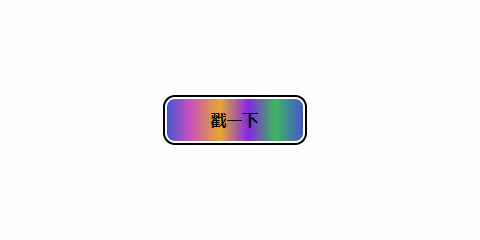
这个按钮效果主要使用
:hover、:active伪选择器以及animation、transition属性来让背景色循环快速移动形成视觉效果。
核心代码部分,简要说明了写法思路;完整代码在最后,可直接复制到本地运行。
核心代码
html 代码
<button>戳一下</button>
写上主体
button标签。
css 部分代码
button{
  width: 140px;
  height: 46px;
  font-size: 16px;
  font-weight: 700;
  color: black;
  border: 2px solid #ffffff;
  border-radius: 10px;
  background-color: #4158D0;
  background-image: linear-gradient(90deg, #4158D0 0%, #C850C0 17%, #e6a731 39%, #8329e2 60%, #3fb75f 80%, #4158D0 100%);
  box-shadow: 0 0 0 2px #000000;
  cursor: pointer;
  transition: all 0.5s ease;}button:hover{
  color: #ffffff;
  animation: quick 0.5s linear infinite;  /* 设置动画参数且循坏播放 */}@keyframes quick{
  to {
    background-position: 140px 0;  /*  这里的X轴的值等于button的宽度 */
  }}button:active{
  transform: translateY(1px);}
css 部分主要通过
:hover伪选择器判断鼠标悬浮时,设置animation参数让背景色沿 X 轴循环移动。
注意这里变化的
background-positon部分的 X 轴值等于按钮宽度,即140px,这样动画循环播放时就不会造成视觉断层。
完整代码如下
html 页面
<!DOCTYPE html><html lang="zh">
  <head>
    <meta charset="utf-8">
    <link rel="stylesheet" href="style.css">
    <title>多彩变化的按钮</title>
  </head>
  <body>
    <div class="app">
      <button>戳一下</button>
    </div>
  </body></html>
css 样式
/** style.css **/.app{
  width: 100%;
  height: 100vh;
  position: relative;
  display: flex;
  justify-content: center;
  align-items: center;}button{
  width: 140px;
  height: 46px;
  font-size: 16px;
  font-weight: 700;
  color: black;
  border: 2px solid #ffffff;
  border-radius: 10px;
  background-color: #4158D0;
  background-image: linear-gradient(90deg, #4158D0 0%, #C850C0 17%, #e6a731 39%, #8329e2 60%, #3fb75f 80%, #4158D0 100%);
  box-shadow: 0 0 0 2px #000000;
  cursor: pointer;
  transition: all 0.5s ease;}button:hover{
  color: #ffffff;
  animation: quick 0.5s linear infinite;}@keyframes quick{
  to {
    background-position: 140px;
  }}button:active{
  transform: translateY(1px);}
以上就是所有代码,以及简单的思路,希望对你有一些帮助或者启发。
转自51cto


- 栏目导航
- 最新文章
-
-

wps office 设置密码方法
WPS密码设置方法1WPS密码设置方法2Office密码设置方法1Office密码设置方法2...
-

Win10系统添加开机启动项的步骤
右击开始点运行或按下Win+R,弹出运行窗口输入shell:startup点确定跳出这个文件夹。C:\Users\Adm...
-

麒麟系统命令行常用快捷键介绍
基本快捷键如下:Ctrl+C:终止当前正在运行的命令。当命令卡住或不想继续执行时,可以使用此快捷键强制终止。Ctrl...
-

银河麒麟桌面操作系统进不去系统怎么备份用户数据 Livecd备份数据教程
编写人:张展鹏编写日期:2023/11/27一.操作前准备准备好系统盘和存放数据的光盘或者u盘(有网络的机器登录网页邮箱...
-

七类网线水晶头接法制作步骤教程图解
技发展越来越迅速,我们目睹了综合布线行业的更新迭代,最开始常用的五类线、超五类线渐渐被六类线、超六类、七类线所取代,今天...
-
- 热门文章
-
-
wps office 设置密码方法
WPS密码设置方法1WPS密码设置方法2Office密码设置方法1Office密码设置方法2...
-

共享打印机错误0x000003e3解决方法
最近有的小伙伴在使用打印机的时候遇到了一系列的问题,有的是最新的更新补丁导致,有的却是其他原因。这不最近就有小伙伴问,自...
-
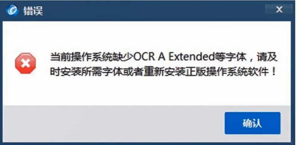
当前操作系统缺少OCR A Extended等字体,请及时安装所需字体或者重新安装正版操作系统软件,黑体 解决方法
安装的航天信息开票软件无法打印,提示”“当前操作系统缺少OCRAExtended等字体…”,具体解决方法如下:打印发...
-
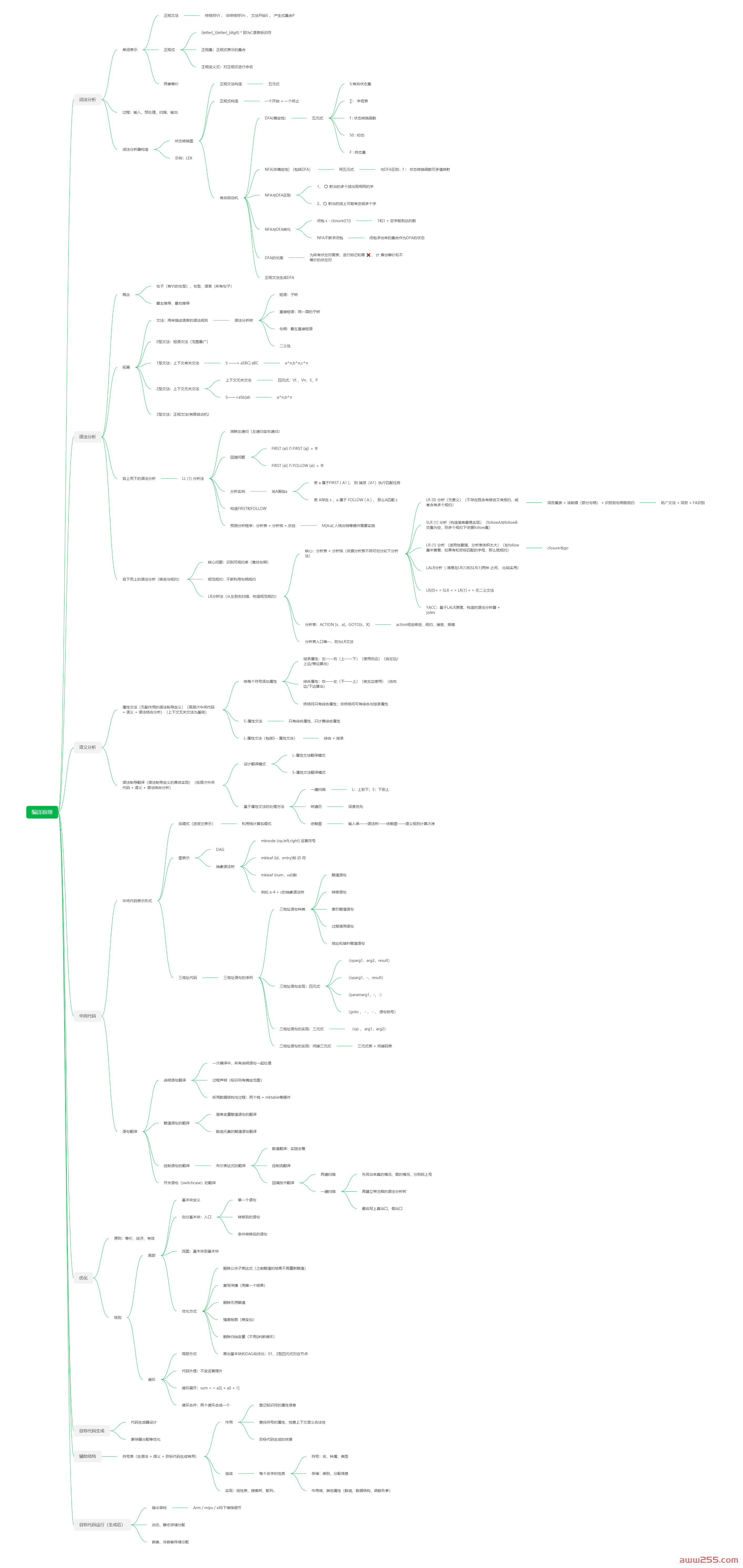
编译原理总结(《编译与反编译技术》)
编译原理总结(《编译与反编译技术》)转自CSDN编译原理总结思维导图引论什么是编译程序?编译过程都包括哪些阶段?画出编译...
-

VB窗体初始最大化和改变窗体大小自动缩放控件及字体
1、模块代码:'标准模块声明写入(自定义类型)Type cp ...
-
- 最近发表
-
- 兄弟L2370DW碳粉、硒鼓完整清零操作教程
- Windows 10/11 共享打印机报错修复工具V1
- 惠普HP中文M207 M208 M209 M211 M212 M232 M233 M234 M236 M237系列维修手册+故障排除
- 佳能MF641Cw MF643Cdw MF642Cdw MF644Cdw 系列打印机,有纸提示装入纸张怎么解决?
- 爱普生M1108 M1128 M1129 1100 1120清零维修调整程序
- 发票闪印 4.4.26
- 施乐P355/M355/P455/M455等机型 清除“fusing unit life rep lace soon”错误或定影组件计数清零操作方法
- 柯美C558第三纸盒卡纸故障案例|纸张卡在进纸轮与阻纸轮之间解决方法
- 佳能清零软件Service Tool v4.718 (G系列 PRO系列)
- 柯美复印机安装mac驱动程序时,不会显示名称末尾带有(S)的驱动,无法安装默认为单面打印的驱动程序
- 随机标签
-
历史(1)3530(1)语音合成(3)操作使用(1)多人(1)固定资产管理(1)有声的紫襟(4)M154(1)精修磨皮(1)3D坦克大战(1)第一序列(2)IP搜索(1)组策略(1)2022(1)内嵌框架(1)ERROR(1)爆笑物理(1)0基础(1)管理系统(1)E002(1)碳粉提示(1)打印配置(1)M254nw(1)成像装置(1)搜索工具(1)HTML(4)7520(1)图解(2)按键无反映(1)埃隆(1)电脑(1)Blocker(1)Workstation(1)两本(1)自动登录(1)M437n(1)打印系统(1)Zktime5.0(1)兄弟(36)M280(1)测试卷(1)广播剧(1)密码(2)excel表格(1)东芝(66)苗疆蛊事2(1)言归正传(1)视频教程(1)报错 01b3b8e6(1)猫腻(2)
网址:aww255.com | aww255.net | 邮箱:awwoffice@qq.com | QQ:158695710 | 版权投诉
皖ICP备2023005925号 |  皖公网安备34110202000686号
| 米爸爸分享网 | 小A分享网 | TXT地图 | HTML地图 | XML地图 | 管理
皖公网安备34110202000686号
| 米爸爸分享网 | 小A分享网 | TXT地图 | HTML地图 | XML地图 | 管理